Action > Nintendo > Clash At Demonhead
Release Date: December 31st, 1989
Publisher: Vic Tokai
Developer: Vic Tokai
Genre: Action - 2D Platformer
Posted: February 14th, 2006
Last Updated: February 16th, 2009
On-Site Links |
 View More Images |
Off-Site LinksGameSpot Entry |
ESRB Rating: Also Available On: Also Released As: |
Number of Players: Prequels, Sequels and Expansions: Average Completion Time: |
Similar To: Related To: |
This title definitely stuck out at me when I was looking through some old Nintendo game screenshots. I wasn't sure why at first, and then once I started playing it I realized that the music was really familiar and I knew the game. I don't quite sure know where I played this, or if I actually owned it but I remember playing this game early in childhood, most likely around four years old. So here goes another nostalgic trip into Nintendo history of this totally underrated game.
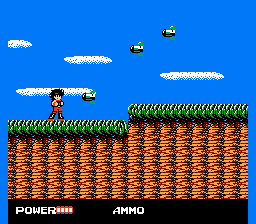
 Clash at Demonhead combines both action platformer, a lot like Mega Man with elements of Role Playing including buying/inventory and also a force (magic) system; therefore, The game is fairly unique in it's execution. The game itself is a translation port from the japanese version called "Dengeki Big Bang!". There is a big emphasis on the anime look and feel of this game, which may get you asking "Is this game based on a series or something?". The answer is surprisingly no. The translation is actually fairly well done, although there is a couple faults but makes up for it with the amount of comedy they add in the dialog. One particularly humorous sequence of dialogs is shown in this animated gif
There is many "annoying" or poor elements to the game and I will list some briefly. You would assume the sky would be limitless (like in Super Mario Bros.) where you can jump partly out of the screen. But in this game, it is actually just an invisible ceiling, which means your character can never jump higher then the screen limit otherwise he will bump into an invisible barrier which gets very annoying. Many terrain sets are re-used and overused, come on, this is just design laziness. Water seems to be some kind of poison as it hurts you even tough sometimes you aren't even under for a quarter of a second, this is most likely some type of bug. There is lots of enemies in the game, it's just too bad most of them are just carbon copies with different graphics. The last and most poor element in the game (in my opinion) is the ending. The end boss(es) are very easy and the end moral of the game is pretty lame too. "We must learn to use science correctly".
The music in the game is very catchy and very memorable as was the case with how I remembered the game in the first place. There isn't actually a lot of music or even variations of it in game. But as a I said it is very catchy and surprisingly doesn't get old half way through the game (it didn't for me anyway). The only problem I have with the music system is that when ever you enter a new screen, or even go into your inventory the music goes back to the starting the current song. I found this to get on my nerves sometimes.